20 Clean and Minimal Ecommerce Designs
Ecommerce is an ever-growing industry that is convenient for both seller and buyer. Shoppers can buy products without leaving the house, while merchants can manage a website rather than an entire store. But when developing your online store, you should approach its design the same way you would a physical store, and think about what your customers will want to see. Excessive clutter and confusing navigation will turn visitors away; quality product photos and a clean layout will draw them in. The success of your ecommerce site relies on the functionality of the store, as well as an attractive and professional look.
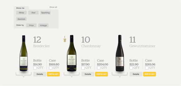
This is a collection of twenty ecommerce websites that are especially appealing in the way of aesthetic design. While different in the way that they reflect their own unique brands, they share certain characteristics – subtle background textures and colors, attractive typography, creative layouts, white space and quality imagery – all resulting in beautiful, minimalistic designs.

Reply
You must be logged in to post a comment.