Updates from greg Toggle Comment Threads | Keyboard Shortcuts
-
greg
-
greg
Band-Aid® Magic Vision
This isn’t particularly recent, but I only now found it. It is a cool (cute) little AR implementation. There’s an iOS app. Basically if you point your camera from within the app at any Muppets-branded Band-Aid, you’ll see a scene featuring one of 3 Muppets. If you don’t have any of the Muppets Band-Aids, there’s an option to e-mail yourself a printable one from within the app. Try it out. It’s fun.
-
greg
Coke | Project Re: Brief by Google
Coke | Project Re: Brief by Google.
Short video about Harvey Gabor – the guy responsible for the Coca-Cola hilltop campaign (“i’d like to buy the world a coke…”
He meets with the ad agency for coke 40 years later to discuss bringing his orignal concept into the 21st century.
-
greg
The Unwritten Rules of a Great Design Critique
**not that anyone reads these articles…
For the most part, web designers work in teams or at least collaborate with other designers and/or developers. This means that at some point in your career you will be involved in many design critiques — some formal and some informal. Sometimes you’ll be the target and at other times you’ll be the one aiming so it’s vital to know how to handle, react and properly conduct yourself during these collaborative sessions.
Design critiques are awesome and they are a huge, gigantic educational opportunity for you, no matter what side of the fence you’re on. If held properly they are very good opportunities to collaborate and learn from other designers and developers. Some firms or companies have very specific guidelines and goals to follow during design critiques but what are the general unwritten rules of a great design critique?
We’ll talk about each one in more detail, but first let’s set the table. Here are ten unwritten (until now) rules you should keep in mind for your next design critique. They are written generally and should be applied to both sides of the equation.
- It’s Not About You
- Maintain Respect and Honesty
- Avoid Meaningless Words and Phrases
- Comparisons Should be Used Sparingly
- Be Specific
- Remember those Design Principles
- Understand the Design Approach and Context
- Ask Why
- Offer Suggestions
- Consider the Goals and Audience of the Design
via The Unwritten Rules of a Great Design Critique | Codrops.
-
greg
Browser Trends October 2012: the Calm Before the Storm? – SitePoint
Worldwide Browser Statistics August 2012 to September 2012
The following table shows browser usage movements during the past month.
Browser August September change relative IE (all) 32.85% 32.71% -0.14% -0.40% IE 9.0+ 17.57% 18.00% +0.43% +2.40% IE 8.0 13.65% 13.08% -0.57% -4.20% IE 7.0 1.16% 1.12% -0.04% -3.40% IE 6.0 0.47% 0.51% +0.04% +8.50% Firefox 22.84% 22.39% -0.45% -2.00% Chrome 33.65% 34.29% +0.64% +1.90% Safari 7.41% 7.70% +0.29% +3.90% Opera 1.64% 1.62% -0.02% -1.20% Others 1.61% 1.29% -0.32% -19.90% -
Bobby
What storm? am i missing something?
-
-
greg
PNC updated their Virtual Wallet site – not the application itself, just the informational site: https://www.pncvirtualwallet.com/
It has its nice points. Over all, however, i found too many jerks and odd redraws.
I like that they went this route – now if they’d only improve the actual Virtual Wallet – no more flash! fewer data calls!-
greg
the old site was better
-
-
greg
BROWSERBITE
Another service… Browserbite helps you create web pages that look the same in all browsers…
BROWSERBITE | Browserbite helps you create web pages that look the same in all browsers..
-
greg
Wikipedia Books
Have you heard of Wikipedia Books? I guess the info on wikipedia is public domain so anyone can just take the text and use it. People will take a topic and compile a bunch of related topics into a book and publish it. There’s actually a tool in the sidebar of wikipedia to facilitate the process. This has been going on since 2007.
Here’s how: http://en.wikipedia.org/wiki/Help:Books
Here’s a catalog: http://pediapress.com/Now let’s all go buy free words from the internet and clutter up our bookshelves!
-
greg
maybe its all just a clever ploy buy the Illuminati to find out who all the dumb g’n people are… and secretly sterilize them. and if it isn’t that… then it SHOULD be.
-
-
greg
LukeW | Data Monday: Mobile Browser Use
Mobile traffic from BlackBerry devices plummeted 25% between September 2011 and July 2012. RIM’s smartphones and PlayBook tablet combined to account for as much as 5% of all mobile usage in the U.S. late last year but as of last month, that figure sank to just over 1%.
via LukeW | Data Monday: Mobile Browser Use.
But by all means, let’s allow a client’s prefered mobile device dictate design and development actions… cause that’s what we’re supposed to do, right?
-
greg
PhoneGap vs. RubyMotion
Interesting and well-done article examining the differences between the two mobile dev platforms. Still going with PhoneGap IMO.
The research for this article is premised on our simple application that we’ve written in both PhoneGap and Rubymotion, called Chatoms. The base concept of this application is fun enough to keep us developing it, but technologically simple enough to serve as an excellent example and exercise.
-
greg
WeChi was created by a Pittsburgh native (Donora,PA). It will launch on June 7.
WeChi is a new social networking ‘game’ that gauges a person’s mood based on feedback from all of their social media outlets. Their mood is conveyed via a descriptive icon, that their networked friends can see. If a person’s mood is down, and their network rallies to their support, then everyone’s Chi goes up. Start gaining enough Chi, and you can exchange it for credits toward donations to charitable causes. Get too much Chi, and WeChi algorithms become suspicious and adjust your score accordingly.
WeChi is an example of a “Fourth Sector” organization: for-benefit businesses, created for the public good. Here is more about WeChi and some links to articles about the Fourth Sector, which is interesting in itself:
-
greg
Understanding the Rule of Thirds in Web Design
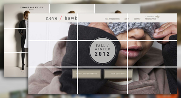
In its most simple form the rule of thirds refers to a 3 by 3 grid that fits on top of any image. There are no specific sizes to the blocks – only that they are equally shaped. The grid works horizontally or vertically and helps you determine how the eye follows an image or group of images (such as a website).
The rule of thirds has been around for several hundred years, with the first written reference by John Thomas Smith in “Remarks on Rural Scenery” 1797. He wrote about the philosophy and how it pertained to painting and art, giving it the name “rule of thirds,” a phrase that is now used commonly among artists, photographers and designers.
While the rule of thirds can be used intentionally in art, photography or design, it is also an ever-present concept. Even when you don’t plan or accommodate for it, the rule of thirds exists. Your job is to use it to your design advantage.
Read more at Understanding the Rule of Thirds in Web Design | Codrops.
-
greg
SASS vs. LESS
“Which CSS preprocessor language should I choose?” is a hot topic lately. I’ve been asked in person several times and an online debate has been popping up every few days it seems. It’s nice that the conversation has largely turned from whether or not preprocessing is a good idea to which one language is best. Let’s do this thing.
Really short answer: SASS
Slightly longer answer: SASS is better on a whole bunch of different fronts, but if you are already happy in LESS, that’s cool, at least you are doing yourself a favor by preprocessing.
Much longer answer: Read SASS vs. LESS | CSS-Tricks.
-
greg
Google and the semantic web
http://mashable.com/2012/05/16/google-knowledge-graph/#i haven’t seen it in action yet.
-
greg
5 Reasons Why Metaphors Can Improve the User Experience
There are many ways to experience the world around us. Especially offline, we can make use of our different senses to collect information, interpret our environment and make judgments.
On the Web, however, our senses are more limited. As designers, we need to present information carefully to make sure our users think, feel and do the right thing.
A great way to help your users understand abstract content, create a sense of familiarity, trigger emotions, draw attention and motivate action are metaphors.
Find out the 5 Reasons Why Metaphors Can Improve the User Experience.
-
greg
40 Excellent Fonts to Use Through Google Web Fonts
In recent years the possibilities for using a wide variety of fonts and typefaces in web design has come a long way. There are now several different options for approaches that you can take when you want to use a font other than the basic, standard web safe fonts. Google Web Fonts has quickly become one of the leading options.
With Google Web Fonts it is quick and easy to implement a wide variety of fonts into the websites that you design and code. There are currently more than 500 fonts that are available through Google Web Fonts, and many of them are of sufficient quality to use in professional designs. This post features 40 fonts that we can start using today.
40 Excellent Fonts to Use Through Google Web Fonts | Vandelay Design Blog.
-
greg
Nielsen: Smartphones Used By 50.4% Of U.S. Consumers, Android 48.5% Of Them
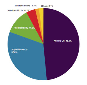
Nielsen today became the latest analyst house to call it for smartphones outnumbering more basic devices in the U.S. The company says that in March 2012 smartphones were in use by 50.4 percent of consumers in the country, with Android continuing its domination in the space, accounting for 48.5 percent of all smartphone handsets.
Apple is not a very close second, at 32 percent, but through that percentage it has remained the single-biggest smartphone handset brand.
The 50.4 percentage of smartphones represents growth of about three percent since December 2011, when 47.8 percent of mobile consumers were using smartphones. That seems to suggest that while smartphone penetration continues to grow, the numbers seem to be slowing down a bit in the U.S.
Nielsen also broke out some numbers on how different ethnic groups are using smartphones. Asian Americans, it notes, have the highest usage, at 67.3 percent using a smartphone as their primary mobile handset.
Hispanics were in second place with 57.3 percent of the group using smartphones, with African Americans closely following with 54.4 percent. Whites had the lowest penetration of all, with 44.7 percent.
Nielsen doesn’t really give an explanation for why these percentages play out as they do — but one guess for the lower number among whites is that perhaps they were some of the earlier adopters with previous generations of mobile handsets and so are therefore slower to convert to the newer devices.

Another interesting point is that apparently women are edging out men a bit when it comes to smartphone usage in the U.S. 50.9 percent of females had smartphones, while among men it was 50.1 percent. Unsurprisingly, younger users are the most smartphone-savvy, with two out of three 25-34 year-olds using more advanced mobile handsets.
-
Bobby
so is this phones only? or usage of OS’s?? the ipad phenom included? i see so many conflicting numbers about this. I personally believe this but if you read an Apple fan boy site they will try to debunk…
-
greg
I think its more indicative of phones rather than tablets.
-
-
-
greg
Create a great mobile experience for your website today. Please. – Scott Hanselman
People are fascinating with making mobile web sites. It’s amazing that we’re not impressed with the fact we carry tiny supercomputers in our pockets but we’re amazed when a website looks decent on our phones.
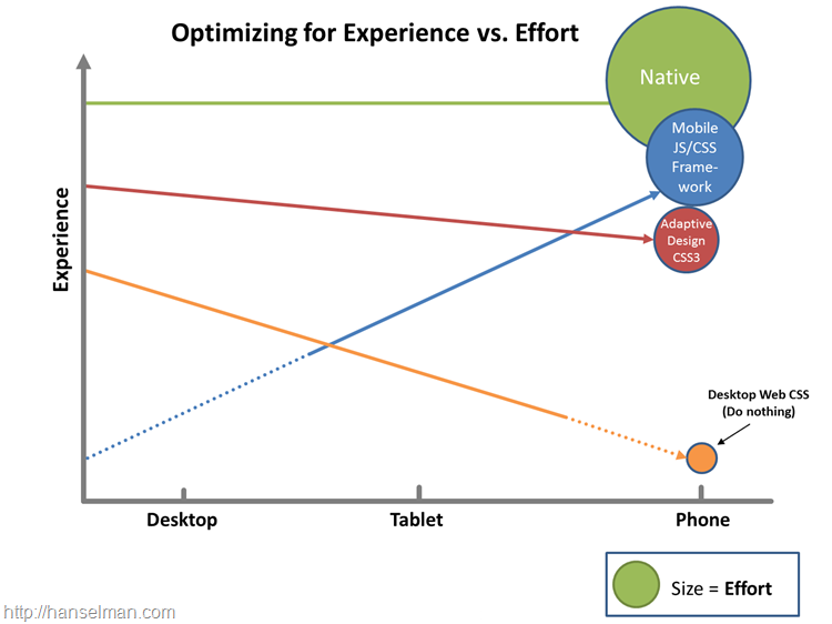
There’s a few directions you can go when going mobile for your site, and the key is finding balance. You can:
- Do nothing. Your site will probably work on a mobile device but each day it will look worse and worse to a discerning public with increasing expectations.
- Use Adaptive/Responsive Design. This is my favorite option. If your site is read-mostly (rather than a data-entry application) you can get a great experience on all devices by adaptively rendering your site based on screen-size. If you’re focused on performance you can add a server-side component and resize image for mobile as well. Visit http://mediaqueri.es for inspiration.
- Use a mobile framework. There’s lots great frameworks like Sencha, Kendo, jQuery Mobile and others. These frameworks can get you near-native looking applications using HTML5 techniques.
- Write a native app. For the time-being while it’s cool to try to get native experiences using non-native tools, it’s hard. The best native experience on a mobile device will remain a native-built application. This requires the most work with arguably the best experience. However, you CAN get 90-95% of the experience with less than 90% of the effort if you use some of these other techniques. Plus, you’ll anger fewer users by not forcing them to download a crappy mobile app by just making a lovely mobile website.
read the rest at Create a great mobile experience for your website today. Please. – Scott Hanselman.
-
Bobby
looks like adaptive / responsive wins again!
-
greg
Good ole Philly: http://goo.gl/d85Nm
-
greg
Nielsen: As U.S. Nears Smartphone Majority, It’s A Two-Horse Race Between Android and Apple’s iOS | TechCrunch
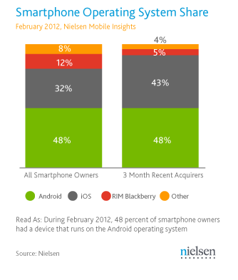
New numbers out from Nielsen today point to just how close the U.S. is to having more smartphone than feature phone users: the proportion that currently owns a smartphone, as of February 2012, is 49.7 percent, say the analysts, a big leap on the 36 percent who owned smartphones a year ago.
What’s increasingly clear in that growth is that, at least in the U.S., no other platform is proving to be a contender against Apple and Google’s Android.
Currently, Android-based smartphones account for 48 percent of all smartphones owned in the U.S., while Apple’s different versions of the iPhone account for 32 percent. Both of those shares have grown: in September 2011, Nielsen said that Android’s share was 40 percent and Apple’s 28 percent.
read more @ Nielsen: As U.S. Nears Smartphone Majority, It’s A Two-Horse Race Between Android and Apple’s iOS | TechCrunch.

Reply
You must be logged in to post a comment.