Updates from greg Toggle Comment Threads | Keyboard Shortcuts

  • greg 11:25 am on March 22, 2012 Permalink |  

    in regards to recent client requests for true value microsites…

    One of the fundamental concepts in UX is notion of affordance: the idea that objects should behave in the manner that their appearance suggests. A push plate on a door affords pushing; a handle afford pulling. How many times have you walked up to a door and found it behaved contrary to your expectations? Invariably this is caused by a mismatch between form and function.

    Likewise, the design of the search box should follow its function. Its purpose is to allow the user to enter queries in the form of keywords, so it should look like it will accept textual input, and have an associated button that clearly indicates its function. It should also be wide enough to comfortably accommodate the majority of queries.


    Check out the whole article. Its kinda off long and technical… but its got a lot of great insight.
    Designing Search: Entering the Query | UX Magazine.

     
  • greg 12:27 pm on March 13, 2012 Permalink |  

    The Photoshop Etiquette Manifesto for Web Designers 

    The Photoshop Etiquette Manifesto for Web Designers.

     
  • greg 2:34 pm on March 9, 2012 Permalink |
    Tags: , ,   

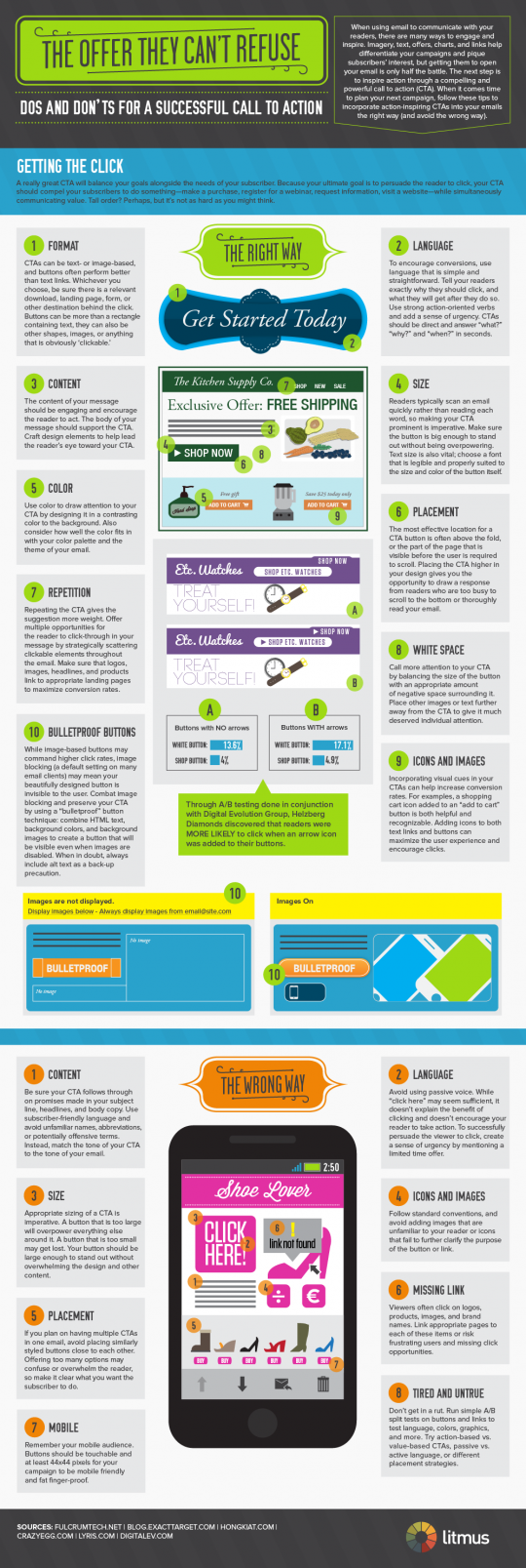
    Designing the Perfect Call to Action 

    Designing the Perfect Call to Action

    Every email you send should have a purpose, and that purpose should be reflected in the call to action (CTA). If you’re not sure what your call to action should be, ask yourself the following questions:

    “What do I want the recipient to do?”

    “How will they know how to do it?”

    “What’s the benefit to them?”

    Paired with the tips from this infographic, the answers to these questions can help you optimize your email design and reach your goals!

    Creating Calls to Action

    Don’t forget there are no rules when it comes to creating great calls to action, just guidelines. What works for your competitor, your friend or your mom might not work for you!

     
  • greg 12:08 pm on March 1, 2012 Permalink |
    Tags: ,   

    WTF QR CODES 

    Look! In the sky! It’s a bird! It’s a plane!

    simple question:  WHO THOUGHT THIS WAS A GOOD IDEA?!

    WTF QR CODES.

     
  • greg 10:35 am on February 28, 2012 Permalink |
    Tags:   

    Leaked documents show Facebook making a radical departure from traditional online display advertising into a world where ads are conversations and brands automatically tell you which of your friends are already on their side.

    The changes described in the article point to even greater integration (and some blurring) between ad copy and wall posts. The article explains the new premium ads much better… check out Facebook’s New, Entirely Social Ads Will Recreate Marketing | LinkedIn.

     
  • greg 11:53 am on February 17, 2012 Permalink |  

    How to write good requirments | Atomic Spin 

    Requirements are pretty ubiquitous in the embedded world. They are used to define tasks, help coordinate large development efforts, and to communicate the behavior of the desired end product between the developers and the customer. When done right, requirements can be very useful. Unfortunately, if you spend much time working in the embedded world you quickly discover that there are a lot of bad requirements. And then when you try to go fix them, you quickly discover that writing good requirements is hard. Here are some tips that will hopefully make the process more clear:

    At a high level, the purpose of requirements is to provide a useful description of the desired behavior of a blackbox system that is detailed enough that:

    • An engineer can make an implementation of said system.
    • A tester could verify that a given device satisfies the requirements (without talking to the engineer)
    • The resulting system satisfies the desires of the end user.

    this is a great article.

    check the tips How to write good requirments | Atomic Spin.

     
  • greg 2:19 pm on February 15, 2012 Permalink |
    Tags: ,   

    The State of HTML5 Video | UX Magazine 

    HTML5 has entered the online video market, which is both exciting and challenging for developers in the industry. With the HTML5 specification and the various browser implementations in constant flux, we at LongTail Video spend a signficant amount of time understanding the limitations of the technology and optimizing our own products for HTML5.

    In developing the JW Player, we perform routine tests across the various browsers and devices to help determine the current state of online video. Our State of HTML5 Video Report is a compilation of our research and latest test results, focused on HTML5 Video playback. We are excited to share our findings with other developers/users in the industry as we explore just what HTML5 can and cannot support.

    We have grouped our test results into the few topics we find to be the most critical for online video. We hope that you will benefit from our findings, and as always, look forward to feedback from the online video community.

    check out the results @ The State of HTML5 Video | UX Magazine.

     
  • greg 11:08 am on February 14, 2012 Permalink |
    Tags: , kentico   

    Kentico CMS for ASP.NET – Web Content Management System 

    http://www.kentico.com

    Kentico (“Ken-ti-co”) CMS is an affordable Web Content Management and Customer Experience Management solution providing a complete set of features for building websites, community sites, intranets and on-line stores on the Microsoft ASP.NET platform. It supports WYSIWYG editing, workflows, multiple languages, full-text search, SEO, on-line forms, image galleries, forums, groups, blogs, polls, media libraries and is shipped with 330+ configurable Web parts. It’s currently used by more than 12,000 websites in 87 countries. The clients include Microsoft, McDonald’s, Vodafone, O2, Orange, Brussels Airlines, Mazda, Ford, Subaru, Isuzu, Samsung, Gibson, ESPN, Guinness, DKNY, Abbott Labs, Medibank, Ireland.ie and others.

     
  • greg 1:49 pm on February 2, 2012 Permalink |  

    Most companies approach standards from a branding perspective. Some may even approach them from an interface design perspective. But there’s more to creating standards, especially for mobile devices. . Mobile platforms differ from traditional computing, for which you can make certain assumptions about the work being performed and the people performing it. And modern mobile devices are different from the phones of the past with T-9 typing and text-based layouts that limited the breadth and variety of interactions you could design.

    Mobile is amazingly versatile, and design for mobile is about the culture of your audience, the tasks they are trying to complete, and the context in which they are completing them. Design for mobile and therefore mobile standards need to be approached from a human perspective. The primary purpose of mobile standards is the same as if they were created for a more traditional interface. From a business perspective, they are created for two reasons:

    • Standards save time and money by avoiding duplication of effort by developers and designers across projects and interfaces.
    • Standards enable the creation of interfaces that are efficient and familiar to users, thereby increasing usability and decreasing the learning curve.

    These two benefits should be fulfilled in any guidelines documentation. But with the advent of standardization of mobile interfaces, there are so many other ways guidelines can be expanded to serve the audiences they affect: the developers and designers who implement solutions based on the standards, and the end-users of the products being created.

    Read the rest of the article:  Raising the Bar for Mobile Standards @ UX Magazine.

     
  • greg 1:32 pm on February 2, 2012 Permalink |  

    Using the HTML5 Geolocation API » SitePoint 

    Knowing the location of your users can help boost the quality of your website and the speed of your service.

    In the past, users had to actively input their location and submit it to a site, either by typing it, using a long drop-down list, or clicking a map. Now, with the HTML5 Geolocation API, finding your users (with their permission) is easier than ever.

    Read up the geloaction HTML5 API at Using the HTML5 Geolocation API » SitePoint.

     
  • greg 1:34 pm on January 30, 2012 Permalink |
    Tags:   

    Responsive Web Design Primer 

    SitePoint posted a nice Responsive primer, although more technical in nature… its still a quick, easy read.

    Responsive Web Design » SitePoint.

     
  • greg 9:49 am on January 27, 2012 Permalink |
    Tags:   

    Anatomy of a Perfect Website
    http://goo.gl/LJCHN

     
  • greg 12:01 pm on January 24, 2012 Permalink |
    Tags: ,   

    Mobile is amazingly versatile, and design for mobile is about the culture of your audience, the tasks they are trying to complete, and the context in which they are completing them. Design for mobile and therefore mobile standards need to be approached from a human perspective. The primary purpose of mobile standards is the same as if they were created for a more traditional interface. From a business perspective, they are created for two reasons:

    Standards save time and money by avoiding duplication of effort by developers and designers across projects and interfaces.

    Standards enable the creation of interfaces that are efficient and familiar to users, thereby increasing usability and decreasing the learning curve.

    These two benefits should be fulfilled in any guidelines documentation. But with the advent of standardization of mobile interfaces, there are so many other ways guidelines can be expanded to serve the audiences they affect: the developers and designers who implement solutions based on the standards, and the end-users of the products being created.

    excellent read at Raising the Bar for Mobile Standards | UX Magazine.

     
  • greg 10:06 am on January 13, 2012 Permalink |
    Tags: ,   

    This is an interesting infographic from Rasmussen College. Multitasking: This is Your Brain on Media illustrates the increase between 1999 and 2009 in media consumption among people eight to eighteen years old. The infographic illustrates not just the increase in media consumption but also the device through which that media is consumed. The most interesting aspect of the infographic is the effect on the brain of multitasking with media. Too bad the data is from January 2010 – i bet the difference in just the last year is significant.

    http://www.rasmussen.edu/images/blogs/1299064473-multitasking-effect-on-brain.png

     
  • greg 11:44 am on January 12, 2012 Permalink |
    Tags:   

    5 Things Every Mobile Design Should Have 

    Okay, so it looks like this whole mobile web fad just isn’t going away any time soon. I’m starting to get the feeling that we’ll need to start designing more mobile friendly websites. As much as we think mobile web design is very different from full screen web design, it really isn’t. Although the screens are smaller and you can touch them, most of the basic principles of design still apply.

    But there are some considerations that you may wish to take when designing for mobile browsers to compensate for some of these little differences. I’ve tried to boil it down to 5 main elements that every mobile site MUST have:

    1. Meaningful Navigation
    2. Focused Content
    3. Feedback
    4. Clear Branding
    5. Plenty of Space

    Now I know there is probably some more elements that every mobile must have, but I feel like these 5 elements are critical pieces that shouldn’t be overlooked and are things we must consider when designing our mobile versions.

    see more examples at 5 Things Every Mobile Design Should Have | Codrops.

     
  • greg 12:45 pm on December 30, 2011 Permalink |  

    The Anatomy of a Perfect Website [Infographic] | Design Inspiration 

    boom.

     
  • greg 11:13 am on December 28, 2011 Permalink |
    Tags:   

    The Myth Of The Sophisticated User 

    The Myth Of The Sophisticated User – Smashing UX Design.

    Interesting article about the two types of users we most frequently encounter. Definite must-read material…

     
  • greg 2:09 pm on December 13, 2011 Permalink |
    Tags:   

    It’s that time of year again, where we look into our crystal ball to see what will be the hot trends in web design for the upcoming year. It’s no secret that trends come and go, with some hanging around longer than they should. (Yes, splash page, I’m talking about you.) But trends are a necessity in the development and growth of our craft. Trends are born, improved upon, and often spawn other trends. So as a web designer, when you apply trends to your projects, challenge yourself to expand upon them and make them your own.

    1. Responsive Web Design
    2. Fixed-Position Navigation
    3. Circles
    4. Big Vector Art
    5. Multi-Column Menus
    6. jQuery/CSS3/HTML5 Animation
    7. Ribbons & Banner Graphics
    8. Custom Font Faces
    9. Infographics
    10. Focus on Simplicity

    check out Web Design Trends in 2012 for the explanations. Chock full o’ great stuff

     
  • greg 12:11 pm on December 13, 2011 Permalink |
    Tags:   

    With consumers increasingly using their handsets to shop, CVS/pharmacy has revamped its mobile site to make the entire CVS.com catalog available to shoppers.

    In addition to being able to purchase items for the first time, the mobile site has been enhanced with additional new functionality such as the ability to redeem coupons and purchase photo prints for in-store pick up. The new site is part of CVS/pharmacy’s ongoing efforts to expand its mobile offerings to serve its customers better.

    “We know our customers like to engage with us in all different ways including shopping in-store and online,” said said Erin Pensa, Erin Pensa, director of public relations for , Woonsocket, RI. “Adding mobile purchasing gives them another option and allows shoppers to purchase what they need – and even refill prescriptions – while on the go.”

    “CVS/pharmacy is committed to making the mobile experience for customers second to none,” she said. “With over one-third of American adults owning smartphones, CVS/pharmacy recognizes the importance of providing useful solutions to our customers, and we’ve worked to optimize and expand the mobile suite to accommodate this trend.”

    via CVS/pharmacy boosts shopability of mobile site with more products – Mobile Commerce Daily – Web site development.

     
  • greg 1:43 pm on December 5, 2011 Permalink |
    Tags:   

    The result of the study found that 75 percent of college students are “Not Likely” to scan a code in the future. This trend should serve as a warning sign to advertisers attempting to reach a younger demographic through QR codes. According to Bart Johnston, the Interactive Director at Archrival, students with Android phones were most proficient at scanning QR codes followed by iPhone users, BlackBerry users and Windows phones users. Females showed slightly more interest in scanning QR codes over males. Some of the colleges included University of Florida, Ohio State, Penn State University, Texas A&M, University of Cal-Berkeley, University of Michigan and North Carolina State.

    check out the full article at Study: Nearly 80 percent of college students can’t figure out QR codes.

     
c
Compose new post
j
Next post/Next comment
k
Previous post/Previous comment
r
Reply
e
Edit
o
Show/Hide comments
t
Go to top
l
Go to login
h
Show/Hide help
shift + esc
Cancel