Conditional Lightbox
I’ve ran into this in the past, do you do a lightbox on a small screen? Initially I thought the answer was yes, but the more I think about the more I realize I was totally wrong. This article expands on the mistake made in the first year or so of thinking RWD:
The purpose of a lightbox is to display a larger image corresponding to the selected thumbnail version while keeping the user on the same page instead of linking directly to a page showing the full image. Again, there are an abundance of solutions for solving this problem but the vast majority of existing patterns translate poorly to smaller displays. In fact you may argue that a lightbox shouldn’t even exist on small displays. — Jordan Moore
I wholeheartedly agree with Jordan, yet I’m seeing more and more lightboxes on responsive sites. There are even plenty of tools and tutorials encouraging designers to continue this flawed pattern (on small screens at least).So what’s a better alternative to lightboxes for small screens?
In his article Why Separate Mobile & Desktop Web Pages?, Luke Wroblewski discusses treating large and small screens differently when handling certain kinds of interactions:
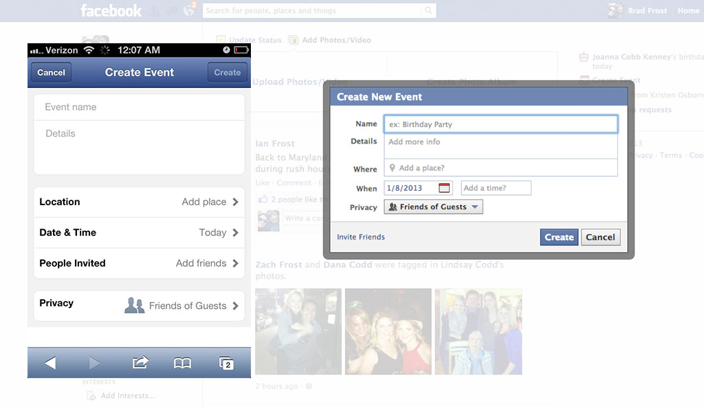
Interactions that happen through modal dialogs or across modules/panels on large screens often make more sense as separate pages on smaller screens. —Luke Wroblewski
Luke and others often point to Facebook as a good example of when small screens get separate pages while large screen get a lightbox.
WORD!

Reply
You must be logged in to post a comment.