iPad App Dos and Don’ts | UX Booth
iPad App Dos and Don’ts | UX Booth.
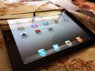
If you’ve spent any time with an iPad, chances are you’ve experienced some level of frustration when getting to know a new application (app). The excitement of a new download might peel away if you see a splash screen—perhaps with an animation or unexpected aural outburst;when it seems your fingers are too fat to properly navigate; or when the app lacks key features found on its parent site.

Reply
You must be logged in to post a comment.