PNC updated their Virtual Wallet site – not the application itself, just the informational site: https://www.pncvirtualwallet.com/
It has its nice points. Over all, however, i found too many jerks and odd redraws.
I like that they went this route – now if they’d only improve the actual Virtual Wallet – no more flash! fewer data calls!
Recent Updates Page 15 Toggle Comment Threads | Keyboard Shortcuts
-
greg
-
Bobby
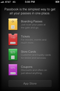
Passbook is the coolest iOS 6 feature you can’t use | Digital Trends
Passbook is the coolest iOS 6 feature you can't use | Digital Trends.
Reviews about how it actually works have been varied. Given the fact that compatible apps are still being introduced, the Passbook testing has been timid. For the most part, however, early users found the process complicated and buggy.
Passbook could be great, and it’s almost certain that bug fixes are on the way. But right now, veteran mobile wallet Lemon’s quick and easy camera capture for card storage is far superior, as is PassSource, where you can log in via desktop for set up purposes. Passbook assume that we can go all-digital, all at once, but did so without partners totally in place of a unified system. Oh, and also, we still have physical wallets full of cards that we need to do something about. It’s messy, it’s buggy, it’s broken – in short, Passbook has big dreams and decent potential, but right now it’s simply an unfinished product on Apple’s part, and the nicest thing anyone can say about it is that it’s a work in progress.Read more: http://www.digitaltrends.com/mobile/problems-with-passbook/#ixzz27UQjKaLu
-
Bobby
Inspired UI – mobile patterns
Inspired UI – mobile patterns.
Get Inspired! This site is awesome for mobile appyness inspiration.
-
greg
BROWSERBITE
Another service… Browserbite helps you create web pages that look the same in all browsers…
BROWSERBITE | Browserbite helps you create web pages that look the same in all browsers..
-
Bobby
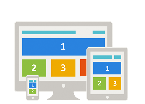
Responsive Web Design Interactive Infographic | Template Monster
Responsive Web Design Interactive Infographic | Template Monster.
This is badass. Click the link. A true “interactive” infographic.
-
Michael
I love this infographic – I just wish it would have been responsive itself – or adaptive even
-
-
Bobby
Adobe Shadow
http://labs.adobe.com/technologies/shadow/?sdid=JRBBP&skwcid=TC|1026867|adobe%20shadow||S|b|12430492260
Check it out on a reliable wifi network. Pretty useful for screenshots and basic testing.
-
Bobby
-
greg
Wikipedia Books
Have you heard of Wikipedia Books? I guess the info on wikipedia is public domain so anyone can just take the text and use it. People will take a topic and compile a bunch of related topics into a book and publish it. There’s actually a tool in the sidebar of wikipedia to facilitate the process. This has been going on since 2007.
Here’s how: http://en.wikipedia.org/wiki/Help:Books
Here’s a catalog: http://pediapress.com/Now let’s all go buy free words from the internet and clutter up our bookshelves!
-
greg
maybe its all just a clever ploy buy the Illuminati to find out who all the dumb g’n people are… and secretly sterilize them. and if it isn’t that… then it SHOULD be.
-
-
Bobby
tiltShift.js – a jQuery plugin using CSS3 filters to replicate the tilt shift effect
tiltShift.js – a jQuery plugin using CSS3 filters to replicate the tilt shift effect.
-
Bobby
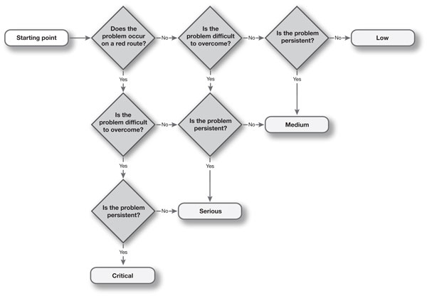
How to prioritise usability problems
A typical usability test may return over 100 usability issues. How can you prioritise the issues so that the development team know which ones are the most serious? By asking just 3 questions of any usability problem, we are able to classify its severity as low, medium, serious or critical.
-
Bobby
-
Bobby
Responsive Design case study | built by Boon
Here is a great case study of a build of a responsive site:
-
Bobby
LukeW | An Event Apart: Content Strategy Roadmap
In her Content Strategy Roadmap presentation at An Event Apart in Chicago, IL 2012 Kristina Halvorson talked about how to integrate content strategy into a typical Web design workflow. Here’s my notes from her talk: read more here > LukeW | An Event Apart: Content Strategy Roadmap.
-
greg
LukeW | Data Monday: Mobile Browser Use
Mobile traffic from BlackBerry devices plummeted 25% between September 2011 and July 2012. RIM’s smartphones and PlayBook tablet combined to account for as much as 5% of all mobile usage in the U.S. late last year but as of last month, that figure sank to just over 1%.
via LukeW | Data Monday: Mobile Browser Use.
But by all means, let’s allow a client’s prefered mobile device dictate design and development actions… cause that’s what we’re supposed to do, right?
-
Bobby
10 Brands Using Responsive Design | Digiday
You know RWD has hit the main stream when online mags like Digiday pick it up and write leading articles about it.
This is a pretty cool collection of RWD sites that major brands are using.
10 Brands Using Responsive Design | Digiday.
-
Bobby
3 tips for PNG optimization
Good post on how to optimize PNG files
PNG (Porable Network Graphics) is considered to be one of the most popular formats, due in large part to its full-featured transparency and lossless data compression. Here are 3 ways to get the most out this format.
-
Bobby
Towards A Retina Web | Smashing Coding
With the recent announcement and release of the Retina Macbook Pro, Apple has brought double-density screens to all of the product categories in its current lineup, significantly paving the way for the next wave of display standards. While the fourth-generation iPhone gave us a taste of the “non-Retina” Web in 2010, we had to wait for the third-generation iPad to fully realize how fuzzy and outdated our Web graphics and content images are.
In the confines of Apple’s walled garden, popular native apps get updated with Retina graphics in a timely fashion, with the help of a solid SDK and a well-documented transition process. By contrast, the Web is a gargantuan mass whose very open nature makes the transition to higher-density displays slow and painful. In the absence of industry-wide standards to streamline the process, each Web designer and developer is left to ensure that their users are getting the best experience, regardless of the display they are using.
Before diving into the nitty gritty, let’s briefly cover some basic notions that are key to understanding the challenges and constraints of designing for multiple display densities.
-
Bobby
Responsive Navigation Patterns | Brad Frost Web
Top and left navigations are typical on large screens, but lack of screen real estate on small screens makes for an interesting challenge. As responsive design becomes more popular, it’s worth looking at the various ways of handling navigation for small screen sizes. Mobile web navigation must strike a balance between quick access to a site’s information and unobtrusiveness.
Here’s some of the more popular techniques for handling navigation in responsive designs:
- Top Nav or “Do Nothing” Approach
- The Footer Anchor
- The Select Menu
- The Toggle
- The Left Nav Flyout
- The Footer Only
- The “Hide and Cry”
There are of course advantages and disadvantages of each method and definitely some things to look out for when choosing what method’s right for your project.
-
Bobby
Mobile Marketing: How do I create a mobile optimized email campaign? – Quora
and EXCELLENT post on Quora about mobile optimized email designs.
Mobile Marketing: How do I create a mobile optimized email campaign? – Quora.Here is a great list of links n’at.
Some recommended resources that our designers use when creating mobile ready emails.
- Designing emails for touch: Part 1(http://stylecampaign.co
m/blog/?p=98 ) and Part 2(http://stylecampaign.com/blog/?p=94 ) (and many other articles at the StyleCampaign blog) - Designing emails for mobile devices – http://www.smartinsights.
com/ema… - Mobile email design in practice – http://www.campaignmonito
r.com/b… - Your Subscribers Are Mobilizing — Is Your Email Program Ready? –http://www.mediapost.com/
publica… - 6 Design Tips for Mobile Email – http://infocenter.emailtr
ansmit…. - Five Keys to Mobile-Ready Email Design – http://chiefmarketer.com/
email/c… - Email insight: future of email part 1 – Mobile – http://emailblog.eu/2011/
03/14/e… - Designing Mobile Friendly Emails – http://blog.campaigner.co
m/2011/… - Menu size for touchscreen phones – http://emailfail.posterou
s.com/m… - Email Marketing Design for Mobile Devices – http://www.strongmail.com
/resour… - 5 Tactics For Successful Mobile Email Marketing – http://infocenter.emailtr
ansmit…. - Mobile Email: Is It Going Anywhere? – http://infocenter.emailtr
ansmit…. - The rapid growth of mobile email – http://infocenter.emailtr
ansmit…. - 5 Ways To Keep The Magic Alive In Your Email Design –http://infocenter.emailtr
ansmit…. - Designing an Email Newsletter: One Column vs. Two Columns –http://infocenter.emailtr
ansmit….
One last thing before you begin your campaign
Your team needs to decide…- Should we create and send a mobile ready email and a normal desktop email separately?
- Should we send a normal desktop email with a link to the mobile version?
- During sign up should we ask our clients whether they want to receive a mobile ready email?
- Designing emails for touch: Part 1(http://stylecampaign.co
-
Bobby
Microsoft’s Site Redesign Will Introduce Mainstream Business To The Responsive Web – Forbes
When I think Microsoft, I think mainstream business. When I think funky startup in Brooklyn, I think Apple. Historically, if you are a designer, and the client said to “make it look more ‘business-like’,” this was often a very bad thing. If the client “designed” a sample to show you how they wanted something to look using a Microsoft product (Word, Powerpoint, remember Front page?) that was even worse. Such “input” was, with rare exception, of the very web 1.0, “let me show you our org chart” (and/or every feature in our incredibly bloated products) variety.
via Microsoft’s Site Redesign Will Introduce Mainstream Business To The Responsive Web – Forbes.
greg 9:53 am on September 26, 2012 Permalink | Log in to Reply
the old site was better