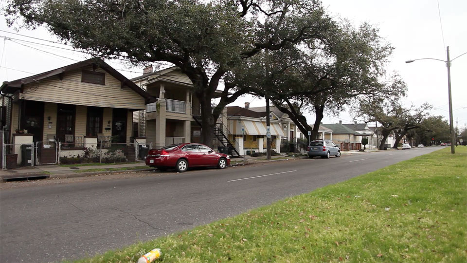
Healing Histories < AMAZING SITE
MUST SEE SITE.
We should all start thinking BIG like this. A great way to tell a story too.
MUST SEE SITE.
We should all start thinking BIG like this. A great way to tell a story too.

10 Facebook Marketing Mistakes to Avoid.
PAY ATTENTION! Great read… lets adhere to this, as I agree with them all.
Official Google Webmaster Central Blog: Recommendations for building smartphone-optimized websites.
A great post on the google “webmaster” *snickering* blog about responsive design and their recommendations.
Every day more and more smartphones get activated and more websites are producing smartphone-optimized content. Since we last talked about how to build mobile-friendly websites, we’ve been working hard on improving Google’s support for smartphone-optimized content. As part of this effort, we launched Googlebot-Mobile for smartphones back in December 2011, which is specifically tasked with identifying such content.
Today we’d like to give you Google’s recommendations for building smartphone-optimized websites and explain how to do so in a way that gives both your desktop- and smartphone-optimized sites the best chance of performing well in Google’s search results.
Your website should be the hub of social interaction, not sitting on the sidelines. It has the potential to draw together conversation across multiple networks and allow users to interact with friends, whether buying a camera or sharing an inspirational quote.
Social Media Is A Part Of The User Experience | Smashing Magazine.
Create a Stitched Text Effect for an iPad Wallpaper | Psdtuts+.
This is one the better tutorials I’ve seen. The effects are outstanding.
this is all done in photoshop:
What Social Media Network is best for your SEO?.
This is why we should be offering Google+ social options to your clients yo:
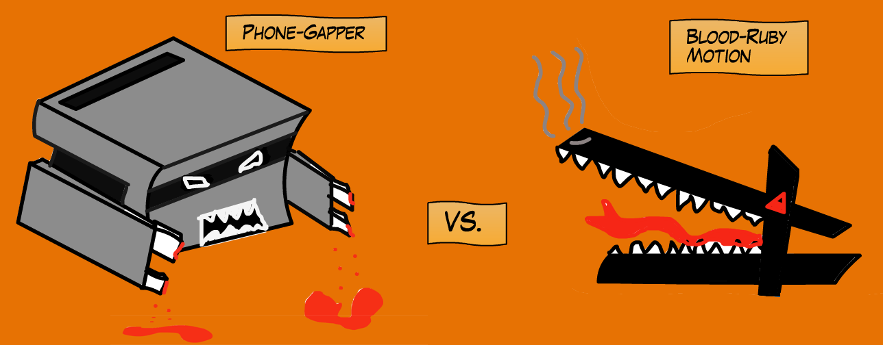
Interesting and well-done article examining the differences between the two mobile dev platforms. Still going with PhoneGap IMO.
The research for this article is premised on our simple application that we’ve written in both PhoneGap and Rubymotion, called Chatoms. The base concept of this application is fun enough to keep us developing it, but technologically simple enough to serve as an excellent example and exercise.
SEC Approves FINRA Rule Changes.
Important info that could effect your client:
The SEC recently issued a release that approves rule revisions submitted last year by FINRA. This will require action from your firm to update its compliance policies and procedures, especially around social media, so we wanted to be sure to bring it to your attention.
The SEC’s release validates the proposed rule changes that we talked about at the beginning of 2012 in two posts:
- FINRA Opens Door for Social Media with New Rules
- SEC Clarifies Stance on Social Media, Takes Action to Punish Social Network-Based Fraud
Before the end of June, FINRA should announce the specific date for implementing the new rules. It has already indicated that the implementation date come before the end of March, 2013 — so your firm must be ready to take action.
WeChi was created by a Pittsburgh native (Donora,PA). It will launch on June 7.
WeChi is a new social networking ‘game’ that gauges a person’s mood based on feedback from all of their social media outlets. Their mood is conveyed via a descriptive icon, that their networked friends can see. If a person’s mood is down, and their network rallies to their support, then everyone’s Chi goes up. Start gaining enough Chi, and you can exchange it for credits toward donations to charitable causes. Get too much Chi, and WeChi algorithms become suspicious and adjust your score accordingly.
WeChi is an example of a “Fourth Sector” organization: for-benefit businesses, created for the public good. Here is more about WeChi and some links to articles about the Fourth Sector, which is interesting in itself:
Google+ Hangouts on the Air HOA = the First True Killer App for Social Media | Social Media Today.
Google + Hangouts represent the first true easy-to-use, easily distributed videoconferencing application; your only requirement being a computer equipped with a web cam, or a 2012 era smartphone.
I love this article, if for one reason only it’s this sentence: “Social media buttons are not a social media strategy.”
HHEEELLLLL YEAH!!
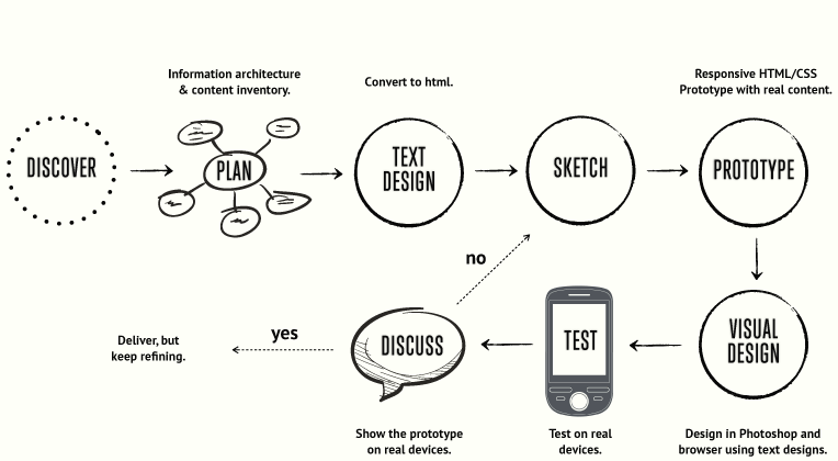
Circle / Design Reconstruction (not only) For Designers.
Awesome way to show the design process for a mobile app update.
Check out this video and visit the site… WELL DONE!
Coke Makes Tumblr Play | Digiday.
A very interesting way to work Tumblr into a digital strategy. Makes sense to me when you read this:
The post was featured on Tumblr’s homepage for approximately five to six hours Tuesday night and received over 20,000 notes (likes and reblogs) during that time.
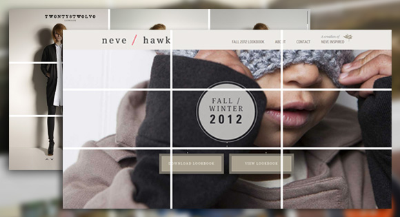
In its most simple form the rule of thirds refers to a 3 by 3 grid that fits on top of any image. There are no specific sizes to the blocks – only that they are equally shaped. The grid works horizontally or vertically and helps you determine how the eye follows an image or group of images (such as a website).
The rule of thirds has been around for several hundred years, with the first written reference by John Thomas Smith in “Remarks on Rural Scenery” 1797. He wrote about the philosophy and how it pertained to painting and art, giving it the name “rule of thirds,” a phrase that is now used commonly among artists, photographers and designers.
While the rule of thirds can be used intentionally in art, photography or design, it is also an ever-present concept. Even when you don’t plan or accommodate for it, the rule of thirds exists. Your job is to use it to your design advantage.
Read more at Understanding the Rule of Thirds in Web Design | Codrops.
The Decline of Apps? Ummm, No – Jeff Hasen.
Interesting take on the native App vs Mobile optimized site argument.
I was thinking about this while sitting on the beach last week and realized that the $$ that apple, android and the app dev/brand makes on the app itself should keep them around for a long while. That is, until they can figure out a way to monetize the mobile web and truly access all the bells and whistles of the device.
Then the question is: Can the mobile web keep up with rapid device advances??? Desktop browsers should answer that question… ouch.

“Which CSS preprocessor language should I choose?” is a hot topic lately. I’ve been asked in person several times and an online debate has been popping up every few days it seems. It’s nice that the conversation has largely turned from whether or not preprocessing is a good idea to which one language is best. Let’s do this thing.
Really short answer: SASS
Slightly longer answer: SASS is better on a whole bunch of different fronts, but if you are already happy in LESS, that’s cool, at least you are doing yourself a favor by preprocessing.
Much longer answer: Read SASS vs. LESS | CSS-Tricks.
Google and the semantic web
http://mashable.com/2012/05/16/google-knowledge-graph/#
i haven’t seen it in action yet.
A List Apart: Articles: Responsive Images and Web Standards at the Turning Point.
The goal of a “responsive images” solution is to deliver images optimized for the end user’s context, rather than serving the largest potentially necessary image to everyone. Unfortunately, this hasn’t been quite so simple in practice as it is in theory.
 greg is discussing.
Reply
You must be logged in to post a comment.