28 Design Tools in 28 Days
https://blog.prototypr.io/28-design-tools-in-28-days-68247ae94542
28 Design Tools in 28 Days
https://blog.prototypr.io/28-design-tools-in-28-days-68247ae94542

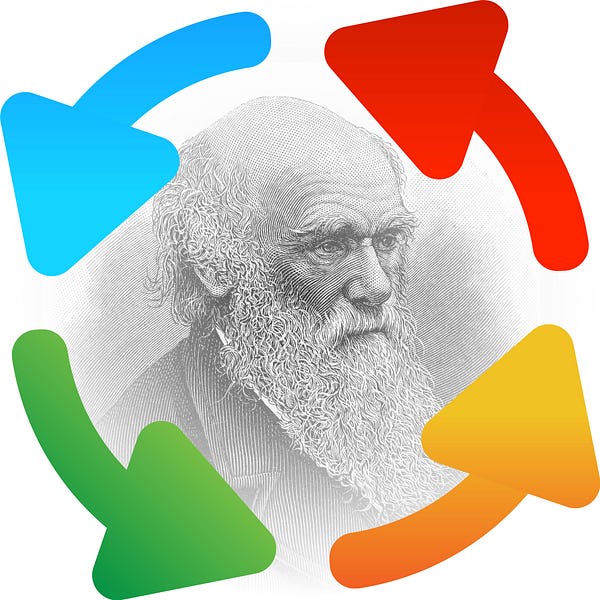
This is so good. “Design Darwinism” HA. I think this is spot on. I think what the problem here is though that you have “Product Managers” trying to think like designers and trying to go around the true design process by iterating instead of actually designing.
Source: Iteration is not design – The Design Innovator – Medium
Being pretty self-taught as far as UI design goes, I’ve always wondered why so many articles and books talk about color theory and palettes. In my experience, using a “split complementary palette” is about 0% predictive of me making nice-looking designs.
I have another word for that sort of thing: useless.
Source: Color in UI Design: A (Practical) Framework – Medium
I struggle with Color Theory too. good read. thanks.
This is decent article about how to hire a UX Designer, I don’t agree 100% with their take on it, but it’s good to get other perspectives.
TLDR; it’s hard and there is a lot to consider.
Hiring has been one of the most challenging and important tasks I’ve had in my career. Hiring the right person for the job is your chance, as a manager, to get things started off on the right foot.
Hiring for a creative design position is a bit easier than for a UX position because you can really get a sense of someone’s design skills simply by looking at their work and asking the right questions. It’s hard to bullshit your way through a portfolio if you didn’t do the work.
UX is different I think. Usually you can’t really see some of the thinking and work that’s done on the UX end of a project. It requires you as a hiring manager to really know what you need. Assessing needs for UX is tricky and then finding the right person is next to impossible.
Another problem is the people doing the hiring. Most of them don’t know what the hell UX is or how it should be set up within an organization. It’s sad really. It’s such a new field and everyone thinks they can just call them selves a UX Designer. I’ve seen product managers, project managers, print designers, account people, all of them try to pivot to UX Designer and I believe it’s going to hurt the industry in the long run, more than help (which isn’t a popular opinion apparently)
Luckily for the savvy and experienced UX Manager you can spot these frauds easily. The problem is there aren’t a lot of managers that were true UXers that have moved into that manager role yet to hire properly. No one knows where to put UX either, its just a mess in pretty much every organization.
Does your organisation have design leadership?
I struggle with this everywhere I’ve worked. Even in agencies that pride themselves on being creative. The issue is that most of the leadership come from the business side and not the design side, when it should probably be flipped.
This is a pretty decent read on why it’s needed to achieve a user centered design of ANY and ALL products you produce as a business.
Source: Supersized. Making design work in large organisations
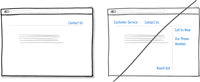
What do you notice about the website above? It doesn’t have a navigation bar. The text links are floating in space and obscured by the background image.
** This is one of those ‘lightbulb’ kind of articles. One that makes you think of something that may have previously been overlooked or even taken for granted.
-g
read more @ The Navigation Bar Is an Affordance, Stop Removing It – UX Movement
Have you ever walked into a friend’s house and realized that he has completely rearranged his furniture? Or gone to your favorite grocery store, only to find the aisles have been reorganized, and your produce, pasta sauce and preferred snacks are no longer in the same spot?
It’s a jarring experience, one that can feel temporarily shocking and strange. This isn’t how I remember things! you might say to yourself. This isn’t right!
Human beings are creatures of habit, and once we have a model for how a certain space should look in our head, finding that model flipped on its head can disorient us.
I read some damn good books this year. Here is the post that points out my 3 fav’s for the UX/UI Designer.
If you’re looking for a holiday gift for the designer in your life, here are a few highly recommended books that were pu…
Source: Top 3 Must-Read Books of 2015 for Digital Creatives and UX Designers (and 2 more) — Medium
This is something that I think any design team, UI or UX or traditional struggle with. There is no such thing as the unicorn, but this is a good place to start.
Source: In Search of the Design Documentation Unicorn — EightShapes LLC — Medium
..[S]tyle guides are particularly important in web projects. They are often the only way to get a consolidated overview of all the components of your site in a single place. That is why this article is designed to be a crash course in style guides for web design.
 Unless you are designing just for the joy of it – or you are one of the fabled ‘unicorns’ who can do EVERYTHING – at some point you will encounter (and probably lock horns with) someone tasked with taking your pretty little pictures and turning them into a real world product. Like cats and dogs, these relationships are historically known for being… strained.
Top 6 frustrations developers have with designers | Web design | Creative Bloq
 A Good User Interface has high conversion rates and is easy to use. In other words, it’s nice to both the business side as well as the people using it. Here is a running idea list to help you out in your next project.
Source: GoodUI
An interesting set of suggestions and a lot of good information in this article. We have all heard of the standard color psychology ideas but the author has some new bits of information – like rounded corners on buttons drawing the eyes inward.
Source: 5 Practical Ways to Increase Conversions on Your Website
It is often thought that user experience is a fancy synonym for design. This is not the case. User experience doesn’t start with design, but with the knowledge that informs the design process. Before someone is a user of a product they are an individual, and it’s this prior active engagement of the user that is key to imagining and designing a product that will fit their needs and deliver an experience that meets or exceeds expectations.
This is some pretty good stuff and worth a listen if you have time. Especially the part about:
why it’s dangerous to bring computer science principles and heavy development tools into web design.
This is an important aspect of job growth and training that I don’t think is done enough. Hearing about developers getting PSDs that are 300dpi and filled with unnamed, ungrouped layers – shameful.
When working in teams made up of designers and front-end developers, there can be a lot of frustration and confusion when it comes to handing assets over from one team member to another. These might be design mockups or icons or high fidelity imagery for banners and the like. Regardless of the content of these handovers, there can always be improvements to this process.
Depending on the project, developers will often require certain materials in order to make development as smooth as possible. So, I’d like to review a couple of steps that designers might take in order to alleviate these pressure points.
Read up on some best practices @ The Asset Handover | CSS-Tricks
 2015 has inherited a lot of trends from previous years, there’s been a steady evolution of ideas — Flat Design into Material Design for example — but nothing as revolutionary as Responsive Design.
However, we are starting to see trends that feel fresh, either through new treatments or because they’re genuinely new ways of approaching old problems. The most widespread of these so far, has been the use of patterns in web design.
Patterns serve a variety of purposes, from communicating a brand value, to adding motion to an interface, to enlivening the simple blocks of color that flat design favors. And the use of patterns, although not scientifically categorizable, falls into one of five broad and inter-related categories…
See some great examples of Designing patterns: the biggest web trend of 2015 so far
Everyone takes resealable bags for granted, but there’s a lot of R&D behind them.
Source: The Surprisingly Complex Design of the Ziploc Bag | WIRED
Reply
You must be logged in to post a comment.