Go to full site – the mobile website escape
Always include a link to the full site for your users. No matter how good your design, some people just want the experience they’re used to. The only thing that likes change is a wet baby.
Keep headings shorter than short
Headings that wrap over more than 2 lines push your content down the page and often out of frame for users. Keep them short, focused and descriptive without telling the whole story.
Use placeholder text on small, common form inputs
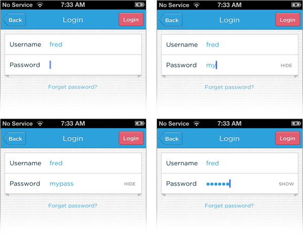
On small forms where context is obvious, use placeholder text instead of labels (eg. login forms, search boxes or address forms).
Place labels above form inputs
When you use labels they should be placed above form elements. Using top-aligned labels makes sure that if the mobile browser zooms in on the input, the user doesn’t lose the context of the input.
Pop-ups suck on mobile
Window management on mobile still sucks. YouTube, Maps, anything that opens native applications takes the user outside the website’s flow and out of context. Do your best to integrate these elements on the page so that users can stay with the website they’re viewing.
Save time with font-based icons
We (heart image) icons! They spice up your designs. To avoid managing a sprite sheet with both retina assets and smaller icons, opt for a font-based icon set like: Font Awesome; glyphish; iconsweets; or symbolset. Or, make your own. Here’s how.
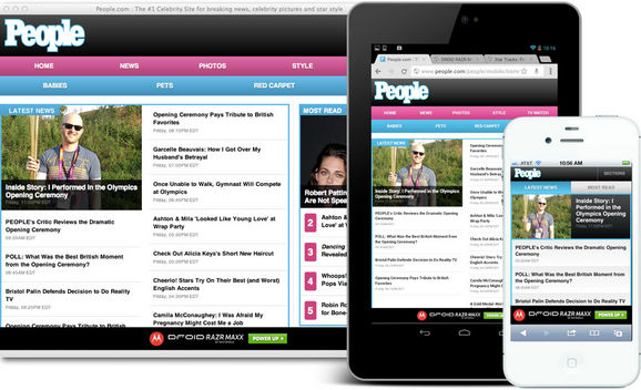
Give your mobile website a mobile-first makeover
Going mobile is about more than just squeezing an existing website into a one-column format. Examine your analytics and your user feedback. Tackle the opportunity to re-imagine your website for mobile and to focus on the important elements. Reorganize content so that it makes sense to the user. Drop extra content blocks. Move elements up or down the page. Add new elements for mobile devices. It’s your site to make amazing.
Make your default font size at least 14 px
Even if that seems really big, it’s the right thing to do. The only time to go smaller (and just to a minimum of 12 px) is on very precise labels for forms.
Respect the fat fingers and tipsy taps of your users
None of us are as dexterous as we’d like to be on our mobile devices. We can all have a touch of “fat fingers” symptoms. So design your actions accordingly. Make the touch targets big. We recommend 40px by 40px.
Give targets lots of margin too. We recommend at least 10px margins around the targets. Primary actions should always be big and tappable.
Embrace the wild and wonderful world of device APIs
When making a desktop site mobile we sometimes forget that smartphones and other mobile devices access user location, can make phone calls, take pictures and much more. Don’t confine your creativity to what’s on your desktop site.
via 10 Mobile Web Design Best Practices | Get Elastic Ecommerce Blog.







Reply
You must be logged in to post a comment.