Things change for an Internet company when the majority of their usage and traffic shifts from desktop to mobile devices. New processes, priorities, and product thinking are required to adapt. But don’t wait too long to change as the shift from desktop to mobile can happen faster then you think… via LukeW | Data Monday: How Long To a Mobile Majority?.
Tagged: mobile Toggle Comment Threads | Keyboard Shortcuts
-
Bobby
-
Bobby
ClickTale Mobile™
They are claiming to be able to record your users’ “every tap, pinch, swipe and tilt” on mobile Web browsers.
This is hardcore if it works and would LOVE to see the analytics it puts out.
-
Bobby
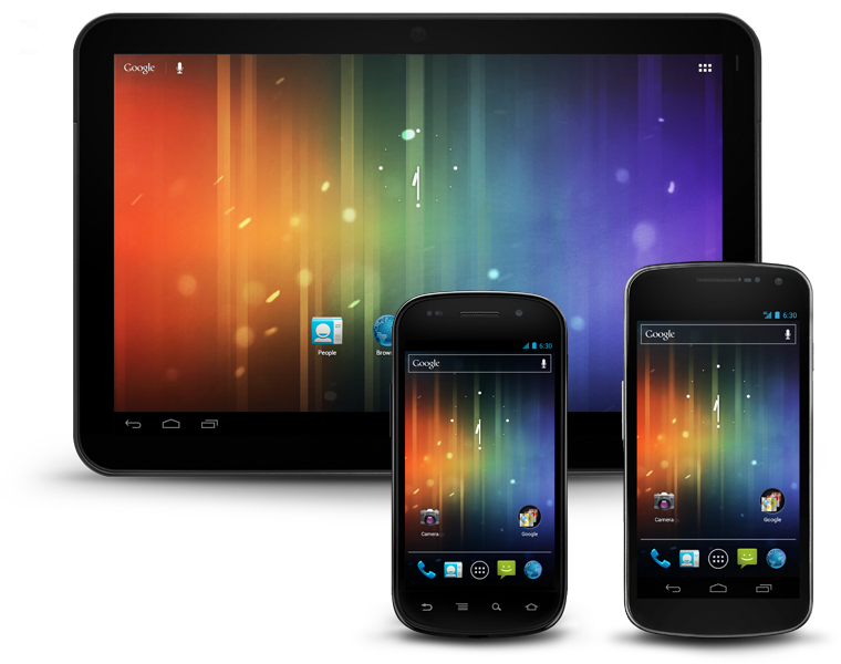
Android Design
I’m not sure why i didn’t know about this site/style guide before today, but glad I found it.
Designing for mobile can be a frustrating and tricky thing, especially for Android.
The latest version of Android is 4.0 or “Ice Cream Sandwich”. I personally think it’s one of the best designs and UI’s I’ve ever laid eyes on. I’ve blogged about the design philosophy behind it before and this site just brings it all together.
Enjoy.
-
Bobby
The QR Code’s Punk Rock Little Brother is Gonna Shake Things Up | Business 2 Community
The QR Code’s Punk Rock Little Brother is Gonna Shake Things Up | Business 2 Community.
I’ve been saying for a while that this kind of stuff is what needs to happen for the mobile marketing and point of sale marketing channel to really take off. We shouldn’t need to have a QR code for our phone cameras to be able to trigger off an event. It can happen with something unique like a logo or image.
This demo is what I’ve been thinking.
The only thing missing is this “scanner” being native in the phone camera itself. Why should I have to open an app to scan something (using my camera) when I already have the camera app itself built into the phone. Just give me the option in the camera app to SCAN something like in Batman Arkham Asylum.. 🙂
Which ever tech company can get that in first will win this QR/AR fight IMHO.
-
Bobby
-
greg
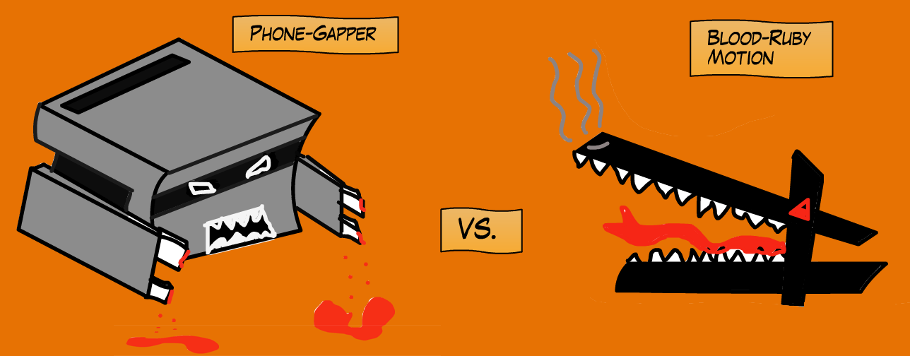
PhoneGap vs. RubyMotion
Interesting and well-done article examining the differences between the two mobile dev platforms. Still going with PhoneGap IMO.
The research for this article is premised on our simple application that we’ve written in both PhoneGap and Rubymotion, called Chatoms. The base concept of this application is fun enough to keep us developing it, but technologically simple enough to serve as an excellent example and exercise.
-
Bobby
Circle / Design Reconstruction (not only) For Designers
Circle / Design Reconstruction (not only) For Designers.
Awesome way to show the design process for a mobile app update.
Check out this video and visit the site… WELL DONE!
-
Bobby
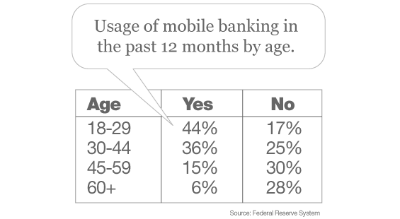
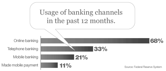
Mobile Banking Set To Explode, Here’s What Marketers Need to Know | The Financial Brand: Marketing Insights for Banks & Credit Unions
Mobile Banking Set To Explode, Here’s What Marketers Need to Know
-
greg
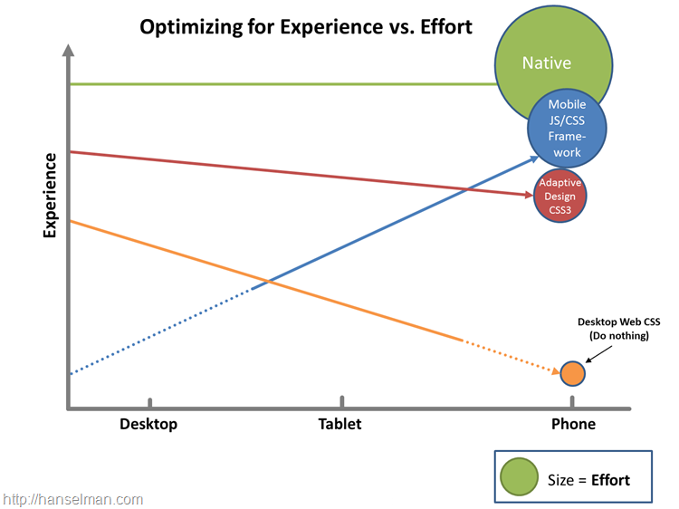
Create a great mobile experience for your website today. Please. – Scott Hanselman
People are fascinating with making mobile web sites. It’s amazing that we’re not impressed with the fact we carry tiny supercomputers in our pockets but we’re amazed when a website looks decent on our phones.
There’s a few directions you can go when going mobile for your site, and the key is finding balance. You can:
- Do nothing. Your site will probably work on a mobile device but each day it will look worse and worse to a discerning public with increasing expectations.
- Use Adaptive/Responsive Design. This is my favorite option. If your site is read-mostly (rather than a data-entry application) you can get a great experience on all devices by adaptively rendering your site based on screen-size. If you’re focused on performance you can add a server-side component and resize image for mobile as well. Visit http://mediaqueri.es for inspiration.
- Use a mobile framework. There’s lots great frameworks like Sencha, Kendo, jQuery Mobile and others. These frameworks can get you near-native looking applications using HTML5 techniques.
- Write a native app. For the time-being while it’s cool to try to get native experiences using non-native tools, it’s hard. The best native experience on a mobile device will remain a native-built application. This requires the most work with arguably the best experience. However, you CAN get 90-95% of the experience with less than 90% of the effort if you use some of these other techniques. Plus, you’ll anger fewer users by not forcing them to download a crappy mobile app by just making a lovely mobile website.
read the rest at Create a great mobile experience for your website today. Please. – Scott Hanselman.
-
Bobby
looks like adaptive / responsive wins again!
-
Bobby
Nielsen is wrong on mobile | Opinion | .net magazine
Nielsen is wrong on mobile | Opinion | .net magazine.
This is an awesome rebuttal to Nielsens latest controversial statement about how the mobile we should be handled.
For all of Jakob Nielsen’s many great contributions to web usability over the years, his advicefor mobile is just 180-degrees backward. His latest guidelines perpetuate several stubborn mobile myths that have led too many to create ‘lite’ mobile experiences that patronise users, undermine business goals, and soak up design and tech resources.
The notion that you should create a separate, stripped-down version for ‘the mobile use case’ might be appropriate if such a clean mobile use case existed, but it doesn’t.-
greg
always thought he was so stiff. has no sense of creativity.
-
-
Bobby
Designing a Mobile App? Don’t Make These 10 Mistakes
Designing a Mobile App? Don’t Make These 10 Mistakes.
Mistakes are always made when doing any project, but if we can think ahead and do our best to avoid these type of mistakes, we’ll be one step ahead of the game.
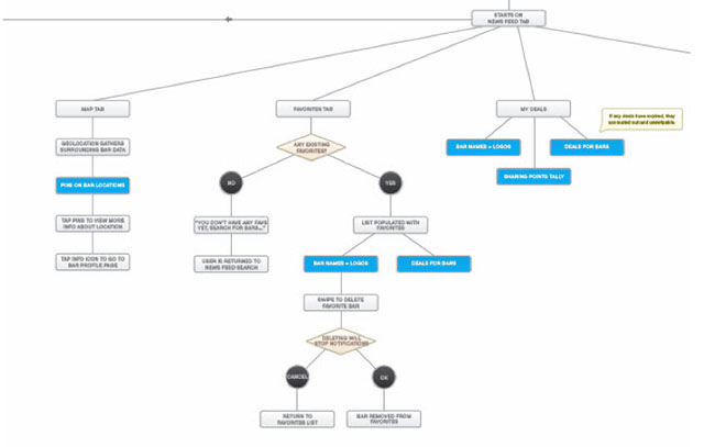
1. Don’t Begin Wireframes or Designs Without a Flowmap
-
Bobby
Mobile UI Design Patterns: 10+ Sites for Inspiration
Mobile UI Design Patterns: 10+ Sites for Inspiration.
I think i’ve posted this before on here, but it’s worth a repeat.
-
greg
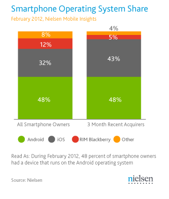
Nielsen: As U.S. Nears Smartphone Majority, It’s A Two-Horse Race Between Android and Apple’s iOS | TechCrunch
New numbers out from Nielsen today point to just how close the U.S. is to having more smartphone than feature phone users: the proportion that currently owns a smartphone, as of February 2012, is 49.7 percent, say the analysts, a big leap on the 36 percent who owned smartphones a year ago.
What’s increasingly clear in that growth is that, at least in the U.S., no other platform is proving to be a contender against Apple and Google’s Android.
Currently, Android-based smartphones account for 48 percent of all smartphones owned in the U.S., while Apple’s different versions of the iPhone account for 32 percent. Both of those shares have grown: in September 2011, Nielsen said that Android’s share was 40 percent and Apple’s 28 percent.
read more @ Nielsen: As U.S. Nears Smartphone Majority, It’s A Two-Horse Race Between Android and Apple’s iOS | TechCrunch.
-
Bobby
Forget QR codes: Your touchscreen can “read” this ink — Mobile Technology News
Forget QR codes: Your touchscreen can “read” this ink — Mobile Technology News.
OK THIS IS AWESOME!
Best part of this is that no new technology is needed for the phone (I THINK). The touchscreen is the trigger…
(via V.)
<iframe width=”560″ height=”315″ src=”http://www.youtube.com/embed/7XT3-IL2pj0″ frameborder=”0″ allowfullscreen></iframe>
-
RyRy
Apple: Rise Of The Gadgets (In 1 Graph) : Planet Money : NPR
We may or may not be living in the post-PC era. But the line between mobile devices and PCs is clearly blurring.
Apple: Rise Of The Gadgets (In 1 Graph) : Planet Money : NPR.
-
RyRy
The Best Instagram Photos Ever Taken [PICS]
A little hyperbole never hurt anything, but these are great pics and remind me to start using my iPhone camera more.
-
Bobby
Sukiennice Museum Case Study
Sukiennice Museum Case Study – YouTube.
More about the Sukiennice campaign from front to end. They used everything. SMS, AR, App Dev.. etc. Excellent!
-
Bobby
Augmented Reality – Sukiennice “Secrets Behind Paintings”
Sukiennice “Secrets Behind Paintings” – YouTube.
Great use of AR.
-
Bobby
Mobile Sites vs. Apps: The Coming Strategy Shift (Jakob Nielsen’s Alertbox)
Mobile Sites vs. Apps: The Coming Strategy Shift (Jakob Nielsen’s Alertbox).
A MUST read. I usually don’t like Jakobs thought process, but I think he’s spot on here. This is some forward thinking that we need to be ready for.
Summary:
Mobile apps currently have better usability than mobile sites, but forthcoming changes will eventually make a mobile site the superior strategy. -
Bobby
With Shortcut App, Kooaba Says QR Codes Are a Thing of the Past
With Shortcut App, Kooaba Says QR Codes Are a Thing of the Past.
What do you think? Are QR codes already old and washed up? Or will they stay the industry standard?

Reply
You must be logged in to post a comment.