Tagged: usability Toggle Comment Threads | Keyboard Shortcuts

  • greg 11:34 am on March 29, 2016 Permalink |
    Tags: usability, ,   

    User on-boarding is a once in a user’s lifecycle experience that—when done well—bridges a delicate journey between your sign up page and your user’s first value gained from your product.

    We refer to this moment of value as a user’s Wow or Aha! moment—Aha like, “Wow this is awesome!” Or “Aha! Now I get it!

    On-boarding experiences often include welcome messages and product tours to get users acclimated. These experiences incorporate common UI patterns that overlay or augment the app’s true interface with annotations.

    We Categorized 327 User Onboarding Experiences Into 9 UI Patterns (Find Out Which You Should Use)

     
  • greg 11:39 am on January 15, 2016 Permalink |
    Tags: , usability,   

    The Navigation Bar Is an Affordance, Stop Removing It 

    What do you notice about the website above? It doesn’t have a navigation bar. The text links are floating in space and obscured by the background image.

    ** This is one of those ‘lightbulb’ kind of articles. One that makes you think of something that may have previously been overlooked or even taken for granted.

    -g

    read more @ The Navigation Bar Is an Affordance, Stop Removing It – UX Movement

     
  • greg 10:20 am on May 11, 2015 Permalink |
    Tags: usability,   

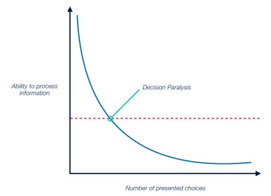
    How to properly simplify your web design with Hick’s Law 

    Why Hick’s Law is crucial to interaction design

    In 1951, British psychologist William Edmund Hick conducted the experiments that led to Hick’s Law, which states that the time required to make a decision increases logarithmically based on the number of choices available.

    Fast forward to the modern age, and Hick’s Law is now a strong argument for clarity and simplicity in web and mobile design.

    Read it @ How to properly simplify your web design | Web design | Creative Bloq

     
  • RyRy 11:46 am on April 14, 2015 Permalink |
    Tags: , , , usability,   

    The best icon is a text label 

    http://thomasbyttebier.be/blog/the-best-icon-is-a-text-label

    Let’s talk about icons now. They’re an essential part of many user interfaces. The thing is: more often than not, they break clarity.


  • Bobby 1:13 pm on October 17, 2014 Permalink |
    Tags: , , usability   

    Why the Flat Design Trend is Hurting Usability.. or is it? 

    An older article about Why the Flat Design Trend is Hurting Usability, got me thinking about this subject again.

    I agree with some of what the article is saying, though I feel saying flat design is hurting usability is a bold statement. I would say instead that designers use of flat design can sometimes be taken too far. When this happens the whole reason to use “flat” as a design technique can backfire  and will created the opposite visual advantages, making the design harder for someone to use.

    I’ve written about this before, but I believe the answer lies somewhere in the middle of skeuomorphism and flat.

    Google does a great job of this I believe. They have flat looking designs but when needed aren’t afraid to use a drop shadows, gradients and strokes for depth and separation of objects.

    I personally feel this technique isn’t skeuomorphic nor is it 100% flat. I’ve ran into more instances where a slight separation is needed to make something stand out of a design or separate it from another element.

    As a designer it’s my job to make solve a problem for a user. If the solution is a slight gradient on a button to make it look like something that is active and requires action, then there is NO harm in doing so and if done well, doesn’t date the design or make it look non-modern.

    B

     
  • RyRy 10:39 am on January 3, 2013 Permalink |
    Tags: , , , , usability   

    6 Easy Ways to Make Your Website Tablet-Friendly 

    6 Easy Ways to Make Your Website Tablet-Friendly.

    If you haven’t already, now is the time to prioritize your website’s design considerations for tablet functionality. Ignoring this could negatively impact your website’s overall conversion rate, return visits, sales and more.

     
  • Bobby 9:59 am on August 31, 2012 Permalink |
    Tags: usability,   

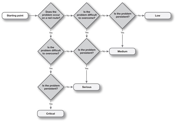
    How to prioritise usability problems 

    A typical usability test may return over 100 usability issues. How can you prioritise the issues so that the development team know which ones are the most serious? By asking just 3 questions of any usability problem, we are able to classify its severity as low, medium, serious or critical.

    How to prioritise usability problems.

     
  • Bobby 11:32 am on March 14, 2012 Permalink |
    Tags: references, usability,   

    Usability.gov 

    Home | Usability.gov.

    This site looks a bit dated but the info in here is priceless and full of useful content.

    LIKE:

    • a .doc loaded with questions that SHOULD be asked at a kickoff meeting.
    • The definition of wireframes (good for new clients not used to the idea)
    • Methods
    • Basics of usability

    and the list goes ON AND ON. It’s a great reference.


  • Bobby 2:46 pm on March 8, 2012 Permalink |
    Tags: do's & Dont's, e-commerce, usability   

    I’ve been thinking a lot lately about e-commerce sites and found this article. It’s an older article but I think it’s still relevant in this day…
    http://uxdesign.smashingmagazine.com/2009/10/08/15-common-mistakes-in-e-commerce-design-and-how-to-avoid-them/

     
  • greg 1:21 pm on November 8, 2011 Permalink |
    Tags: , usability   

    An Extensive Guide To Web Form Usability 

    The ISO 9241 standard defines website usability as the “effectiveness, efficiency and satisfaction with which specified users achieve specified goals in particular environments.” When using a website, users have a particular goal. If designed well, the website will meet that goal and align it with the goals of the organization behind the website. Standing between the user’s goal and the organization’s goals is very often a form, because, despite the advances in human-computer interaction, forms remain the predominant form of interaction for users on the Web. In fact, forms are often considered to be the last and most important stage of the journey to the completion of goals.

    check out the full Extensive Guide To Web Form Usability @ Smashing UX Design.

     
  • greg 1:41 pm on October 4, 2011 Permalink |
    Tags: usability,   

    LukeW on What Impacts Web Form Conversion? 

    There are many things we can do to improve the design of Web forms. But what can we do to really boost conversion? Here’s a few case studies that illustrate how the removal, clarity, and even indication of requirements can have a real impact on form conversion.

    check out  What Impacts Web Form Conversion? from LukeW.

     
  • greg 10:49 am on September 14, 2011 Permalink |
    Tags: , usability,   

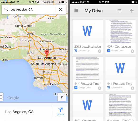
    Do users change their settings? 

    Back in the early days of PC computing, we were interested in how people used all those options, controls, and settings that software designers put into their applications. How much do users customize their applications?

    We embarked on a little experiment. We asked a ton of people to send us their settings file for Microsoft Word. At the time, MS Word stored all the settings in a file named something like config.ini, so we asked people to locate that file on their hard disk and email it to us. Several hundred folks did just that.

    We then wrote a program to analyze the files, counting up how many people had changed the 150+ settings in the applications and which settings they had changed.

    What we found was really interesting. Less than 5% of the users we surveyed had changed any settings at all. More than 95% had kept the settings in the exact configuration that the program installed in.

    This was particularly curious because some of the program’s defaults were notable. For example, the program had a feature that would automatically save your work as edited a document, to prevent losing anything in case of a system or program failure. In the default settings for the version we analyzed, this feature was disabled. Users had to explicitly turn it on to make it work.

    Of course, this mean that 95% of the users were running with autosave turned off. When we interviewed a sample of them, they all told us the same thing: They assumed Microsoft had delivered it turned off for a reason, therefore who were they to set it otherwise. “Microsoft must know what they are doing,” several of the participants told us.

    We thought about that and wondered what the rationale was for keeping such an important feature turned off. We thought that maybe they were concerned about people running off floppies or those who had slow or small disks. Autosave does have performance implications, so maybe they were optimizing the behavior for the worst case, assuming that users who had the luxury to use the feature would turn it on.

    We had friends in the Microsoft Office group, so we asked them about the choice of delivering the feature disabled. We explained our hypothesis about optimizing for performance. They asked around and told us our hypothesis was incorrect.

    It turns out the reason the feature was disabled in that release was not because they had thought about the user’s needs. Instead, it was because a programmer had made a decision to initialize the config.ini file with all zeroes. Making a file filled with zeroes is a quick little program, so that’s what he wrote, assuming that, at some point later, someone would tell him what the “real defaults” should be. Nobody ever got around to telling him.

    Since zero in binary means off, the autosave setting, along with a lot of other settings, were automatically disabled. The users’ assumption that Microsoft had given this careful consideration turned out not to be the case.

    We also asked our participants for background information, like age and occupation, to see if that made a difference. It didn’t, except one category of people who almost always changed their settings: programmers and designers. They often had changed more than 40% (and some had changed as much as 80%) of the options in the program.

    It seems programmers and designers like to customize their environment. Who would’ve guessed? Could that be why they chose their profession?

    (Big takeaway: If you’re a programmer or designer, then you’re not like most people. Just because you change your settings in apps you use doesn’t mean that your users will, unless they are also programmers and designers.)

    We’ve repeated this experiment in various forms over the years. We’ve found it to be consistently true: users rarely change their settings.

    If your application has settings, have you looked to see what your users do? How many have changed them? Are the defaults the optimal choice? Does your settings screen explain the implications of each setting and give your users a good reason for mucking with the defaults?

    via Do users change their settings? » UIE Brain Sparks.

     
  • Bobby 2:03 pm on July 11, 2011 Permalink |
    Tags: , usability   

    Introducing Usaura, the Fastest Way to Run Click Tests 


    The first version of Usaura lets you do one test: a click test. What’s a click test? Basically, you upload a screenshot of your interface, or even just a mockup, and provide instructions to the testers, e.g. “Click on where you think you can learn about the pricing for this product.”

    via Introducing Usaura, the Fastest Way to Run Click Tests.

     
  • Bobby 1:48 pm on June 15, 2011 Permalink |
    Tags: , usability   

    Signup Form Usability and Design Best Practices 

    Signup Form Usability and Design Best Practices.

    Honest usability techniques when applied properly will expand your site layouts beyond the elite in web design. When you can open your mind to new ideas it’s possible to manifest brilliant visions into your web pages. This hierarchy plays double for user interface objects and forms.


  • Bobby 4:45 pm on May 26, 2011 Permalink |
    Tags: , usability,   

    iPad Usability Study Reveals What We Do and Don’t Like In Apps Apple News, Tips and Reviews 

    iPad Usability Study Reveals What We Do and Don’t Like In Apps Apple News, Tips and Reviews.

    Good read and important findings.. like this:

    For example, the study found that users aren’t crazy about using their iPad devices to deal with complicated forms that require lots of user input, especially if those forms are found in non-optimized websites, rather than housed in an app. Users would skip registrations processes rather than deal with inputting information in many cases. The solution to such a problem would be to make forms simpler, requiring less information, and reduce the need for repeat entry of information (so apps that offer to remember login details are better, for example).


c
Compose new post
j
Next post/Next comment
k
Previous post/Previous comment
r
Reply
e
Edit
o
Show/Hide comments
t
Go to top
l
Go to login
h
Show/Hide help
shift + esc
Cancel